Helping field inspectors complete safety-critical inspections faster and with fewer errors in high-risk environments
I translated an 80-page technical manual into a high-contrast mobile app. I replaced manual paper forms with a guided workflow that ensures 100% data accuracy, even when standing feet away from 60mph highway traffic.

The User, The Challenge, My Role
The User
Field inspectors working in high-risk environments where speed, accuracy, and safety are critical.
The Challenge
Inspectors were managing complex asset assessments, strict audit requirements, and paper-based documentation in the field, creating friction, slowing down workflows, and increasing the risk of missed steps.
My Role
As Lead UX Designer, I owned the end-to-end transformation of a manual process into a mobile product. I defined workflows, prioritized critical actions, and designed for real-world constraints like weather, glare, and time pressure.
Design was delivered in two-week sprint cycles alongside engineering.
Key Decisions That Reduced Risk and Improved Usability
Skim the bold headers for the 30-second version, or read the Science column to see the depth behind each choice.
Turning the Manual (SOP) into a Product
The original VDOT SOP was a dense technical document. I broke it down into a Stepped Flow that mirrors the inspector's physical walk-around:
Guided Rating
By using a Stepped Flow, I break the inspection into logical "chunks" (Pavement → Drainage → Traffic Services). This follows Miller's Law, keeping the number of items a user has to remember at any one time to a minimum.
Each inspection is chunked into stages — category, then on-screen criteria — keeping what the inspector must hold in memory to a minimum (Miller's Law). The specific passing criteria (e.g. '201 ≤25% diameter closed') appear on the rating screen itself, so inspectors recognize the standard rather than recall it from the 80-page manual.
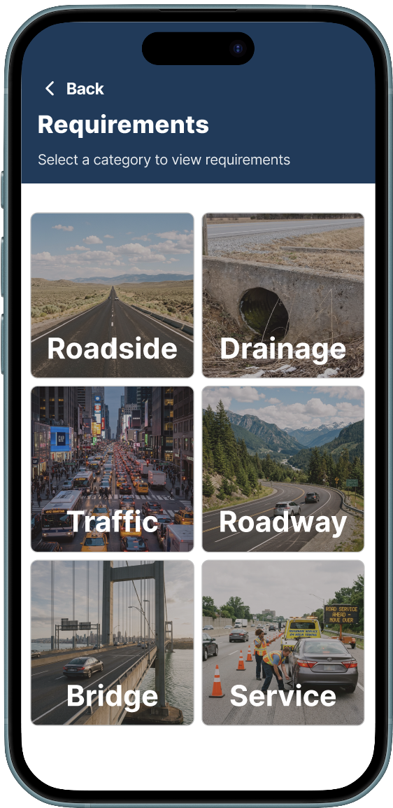
Start broad: pick a category (Roadside, Drainage, Traffic, Roadway, Bridge, Service).
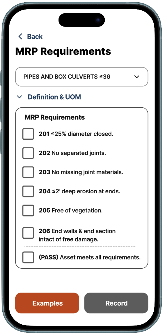
Then rate the asset against pass/fail criteria shown directly on screen.
Instant Failing Reports
If an asset fails, the app immediately triggers a request for a photo and a maintenance note. No offline reconciliation needed.
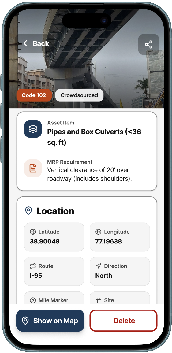
Each record captures a photo, the relevant MRP requirement, and geolocation inline — no offline reconciliation needed back at the office.
Shared Design Language
The mobile app feeds directly into the management dashboard. To keep both products consistent, I built a shared component library in Figma.
Status colors, typography scales, and interaction patterns stay the same whether a user is rating an asset on their phone or reviewing results on a desktop screen.
Usability Study
Study Design
8 participants recruited via Prolific completed three goal-based missions on their own phones, mirroring real field conditions.
Each mission mapped to a critical inspection step:
- Locating an asset on the map
- Rating it against IMCS-626 criteria
- Completing final documentation
After each mission, participants rated the experience on a 7-point Likert scale.
What the Data Confirmed
The inspection and rating workflow performed the strongest. It's the most safety-critical part of the app.
Participants navigated the stepped flow, referenced on-screen criteria, and submitted assessments with low friction.
Likert scores confirmed it: on-screen criteria and the Record button's tap-ability rated highest across all measures.
Where the Data Pointed Next
Two flows showed higher friction: map-based asset discovery and final documentation.
Qualitative feedback surfaced clear patterns:
- "Too many buttons to get to the requirements section"
- Request for batch-upload of records
V2 priorities: simplify the map interaction model and reduce documentation steps.
The Takeaway
The study validated that the core behavioral design decisions, the Stepped Flow, Criteria-at-a-Glance, and oversized hit zones, held up under real mobile use. It also gave the team specific, actionable direction for V2 improvements rather than relying on assumptions.
Impact
By understanding how the human brain processes information under stress, I delivered a tool that is now used across Virginia to manage millions of dollars in road repairs safely and accurately. A usability study validated the core design decisions and gave the team a clear roadmap for what to improve next.
- Reduced reliance on paper manuals, improving speed and accuracy in the field
- Increased inspector confidence in high-risk environments by surfacing criteria on-screen and eliminating the need to recall rules from memory
- Simplified a complex 80-page process into a scalable mobile workflow that can extend to additional asset types and districts
- Validated by data: the inspection and rating workflow, the most safety-critical flow, performed strongest in usability testing, confirming the stepped design decisions held up under real mobile use
- Clear next steps: the study surfaced specific friction points in map discovery and documentation, giving the team an evidence-based backlog for V2
- Part of a connected system. See the Operations Hub case study for the other half
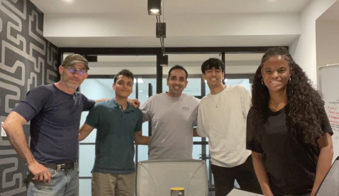
The Team
Sole UX Designer on a 5-person Alpha Team at Leidos: PM, Solutions Architect, Software Engineer, and Engineering Intern.