Empowering government stakeholders with real-time data to prioritize infrastructure maintenance and resource allocation
Field data was trapped in paper forms and delayed spreadsheets, making it impossible for district leadership to identify high-priority maintenance needs quickly. I transformed disparate data sources into a centralized platform that gives government stakeholders real-time visibility and clear prioritization signals.
The User, The Challenge, My Role
The User
Three distinct roles, each with different needs:
- Regular Users: Field inspectors reviewing their own projects and assignments
- Admins: District-level staff managing records for their specific district
- Super Admins: Full system access, approving new users and assigning roles
The Challenge
Field data was being collected on the mobile app, but there was no centralized interface for office staff to view, filter, or act on that data. The platform needed to serve three user roles with very different permission levels and workflows, all within the same interface.
My Role
Lead UX Designer. I owned the full design of the web platform and contributed to front-end development.
Work was delivered in sprint-aligned increments. Stakeholder feedback sessions during sprint reviews helped refine information hierarchy and confirm the design met operational requirements.
Part of a connected system
This platform is the office-side of the same system as the Field Inspection App. The design decisions on each side were made in relation to the other. They're not two separate products.
Two Ways to See the Same Data
Inspectors and managers think about assets differently depending on the task. Sometimes they need geographic context, and sometimes they need to scan a structured list. I prioritized two primary views:
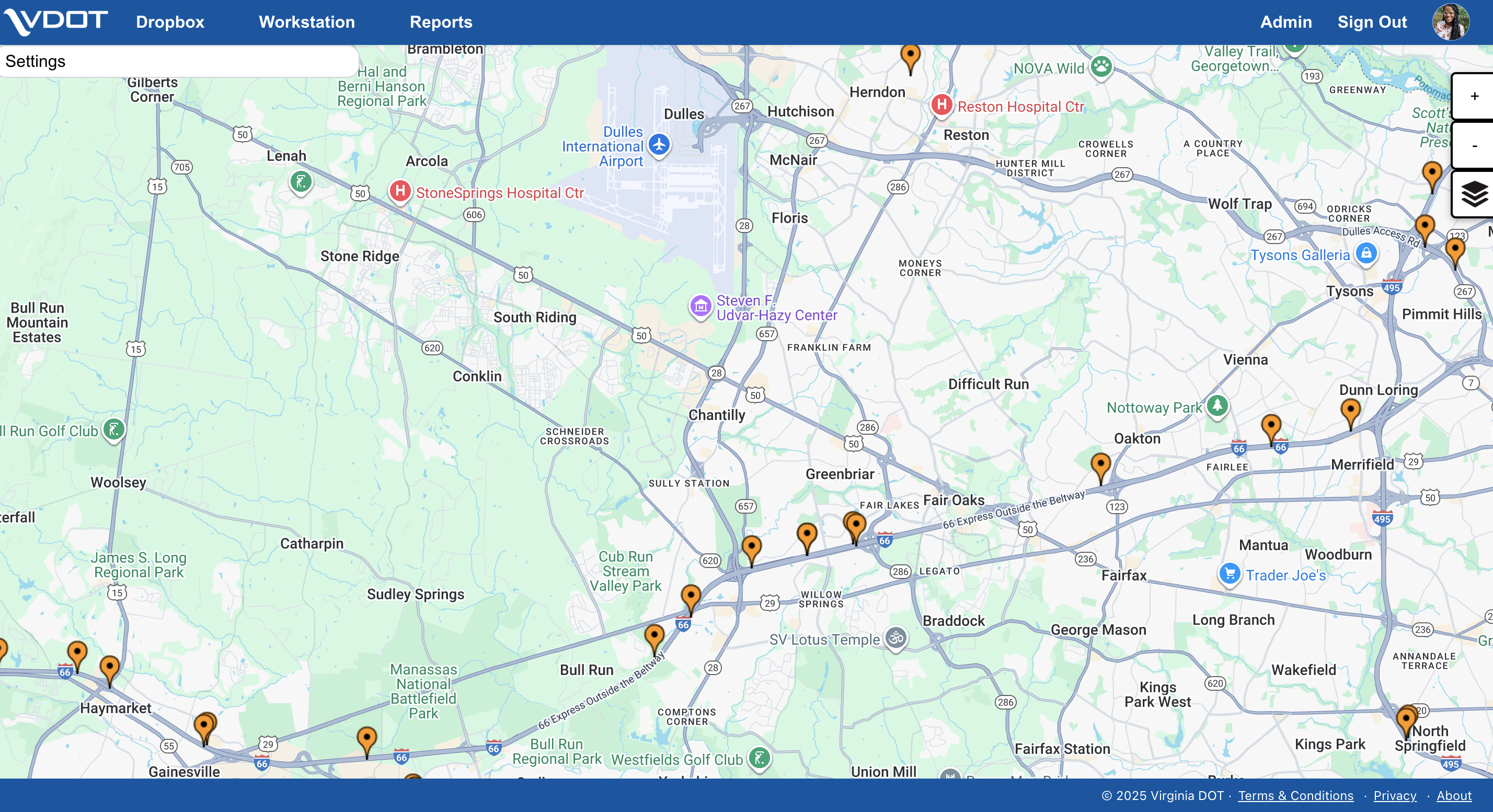
Map View
Field inspection data represented as pins on the map, letting users visually scan asset conditions by location. This mirrors the spatial mental model inspectors already have from their physical walk-arounds in the field.
Tabular View
The same data in a filterable list format for users who need to scan, sort, or export records. Admins use this view most heavily when reviewing district-level asset records.
Role-Based Access
Rather than building three separate interfaces, I structured a single platform with role-gated views:
Regular Users
See their assigned projects, roles, and submitted inspection records.
Admins
See their district's asset records and can manage assignments within their region.
Super Admins
Get full system access, approving new users, assigning roles and projects, and viewing data across all districts.
Solving the Navigation Problem
The hardest design decision was helping regular users orient themselves from the home page. With multiple projects, roles, and views available, it wasn't obvious where to go first.
I solved this with a hover menu anchored to the profile tab. It gives users a quick, contextual entry point to their projects and role-specific views without cluttering the main navigation.
This kept the interface clean for admins while reducing "where do I start?" friction for inspectors who visit only occasionally.
Shared Design Language
This platform is the web counterpart to the mobile field app. I maintained a shared component library in Figma with consistent status colors, typography, and interaction patterns across both.
An inspector who marks an asset "failing" on their phone sees that same visual language when the record appears on the dashboard.
Impact
A centralized web platform that connects directly to the mobile field app. District staff get real-time visibility into inspection data with no manual re-entry.
The role-based architecture scales as VDOT adds districts and users. The shared design system keeps the full MRP ecosystem consistent.
- Field-to-office connection: inspection data flows from the mobile app into map and tabular views with no manual re-entry
- Role-based access: three permission levels serving distinct workflows within a single interface
- Front-end contribution: I supported development alongside design, closing the gap between prototype and production
- Part of a connected system. See the Field Inspection App case study for the other half
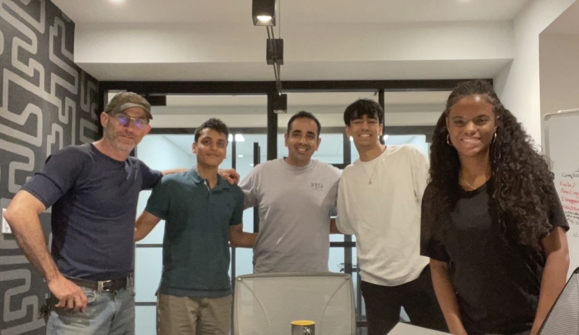
The Team
Sole UX Designer on a 5-person Alpha Team at Leidos: PM, Solutions Architect, Software Engineer, and Engineering Intern.