Improving fleet operational efficiency by translating complex telematics data into actionable insights
Research teams were data-rich but insight-poor, struggling to identify which vehicles required immediate attention from dense desktop screens inside a moving vehicle. I restructured the experience as a mobile-first tool that surfaces critical alerts and puts the most important information first.
The redesign
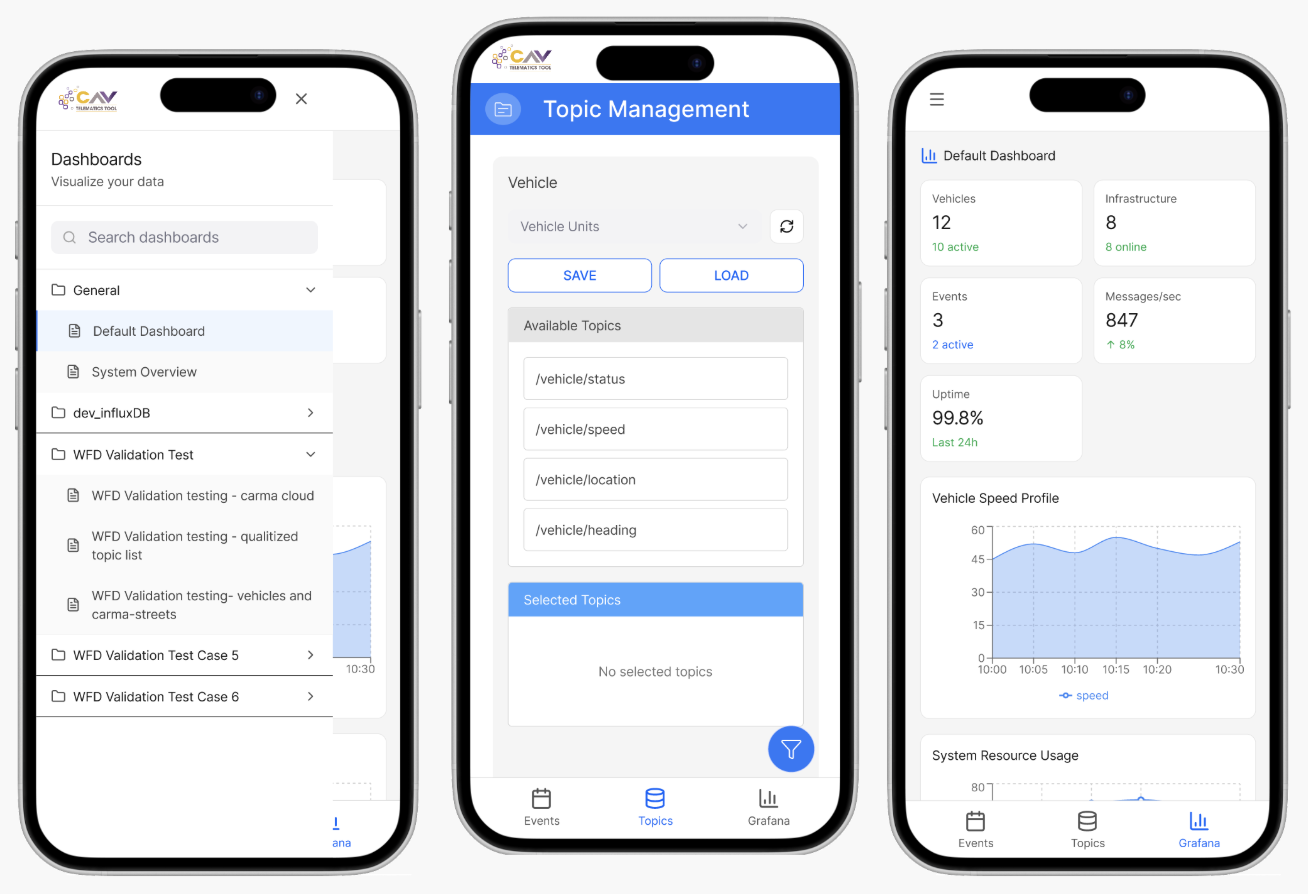
This redesign transformed a dense desktop telematics tool into a mobile interface built for field decisions under time pressure.
I worked within a compressed agile sprint, using competitive references and heuristic findings to set redesign priorities.
Who is this product for?
Internal Leidos research teams conducting vehicle studies. They monitor telematics data, check event details, and make operational decisions while on the road.
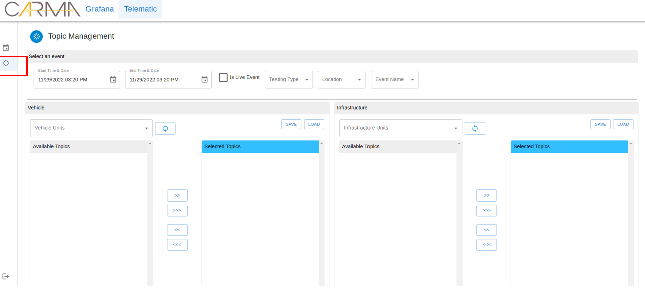
Previously, all of this data required a desktop. This redesign brought it to mobile.
Goals
- Provide mobile-first access to vehicle and event data for on-the-go research teams
- Support field decision-making with clear information hierarchy and quick actions
- Reduce navigation friction by simplifying desktop workflows for mobile contexts
- Maintain terminology consistency with the existing web platform for familiarity
- Enable quick scanning of vehicle status and event details on small screens
Why is this needed?
Research and field teams needed to interpret complex vehicle telemetry in real time, but the legacy workflow depended on dense, spreadsheet-like web layouts that were difficult to use in active field conditions. This increased navigation friction and delayed time-sensitive interpretation tasks.
HF Contribution (Benchmarking)
- Conducted a Competitive Systems Analysis of existing telematics platforms to identify industry-standard mental models for data visualization
The Human-System Interface (HSI)
Prioritized glanceable telemetry data to support situational awareness for researchers in the field, with clear hierarchy for faster interpretation and intervention decisions.
Glanceable data hierarchy
Safety-critical telemetry markers are visually separated from informational data so field users can assess status at a glance without reading through dense tables.
Simplified navigation for mobile
Desktop workflows that required 4–5 taps were condensed into a single contextual action, reducing the number of decisions a researcher needs to make while on-the-road.
Terminology consistency
Kept all labels and terminology aligned with the existing web platform so experienced users don't have to re-learn the system, just the interaction model.
Pattern reuse from the legacy platform
I carried over established patterns from the existing web system: data cards, status indicators, and alert hierarchies. I adapted them for mobile rather than rebuilding from scratch.
This kept the learning curve low for teams already familiar with the desktop tool.
Who'd I work with?
I collaborated with product stakeholders and engineering to define scope and feasibility, then used competitive references and heuristic findings to drive redesign priorities where direct primary research was limited in this phase.
Impact
Produced a mobile-first decision support tool with clearer telemetry hierarchy and safer field usage.
The redesign provides a practical foundation for future implementation focused on operator performance in live research contexts.